Here is the thing about the journey from a website view to conversion in this modern era—it’s about building everything possible the way your audience will find it great. Everything. Gone are the days when an attractive design alone could provide you with a high converting website.
Everyone is one-upping the other on the aesthetic front. Your website conversion rate now depends on convenience, relatability, and speed besides appeal and other factors. Moreover, website conversion rate directly affects how much response and revenue your website helps generate.
Wondering how to build a high converting website? This guide will show you how, step by step!
The Ultimate Guide to Building a High-Converting Website for Small Businesses
The World Wide Web is filled with run-of-the-mill content. The high converting website you need must be user-friendly yet exceptional to attract and retain your target audience and drive. It sounds challenging—till you break it down into smaller, doable steps.
So, how to build a website for conversions?
1. Start With In-Depth Market Research
When you want to build a high converting website to cater to a specific market, it only makes sense to first look into that market. Who are your potential customers and what are they looking for? Who are your competitors, and what are their websites offering?
Answering these questions will help you make an informed web development approach. Therefore, when it comes to what’s a digital storefront and you have the goal of e-commerce sales, deep dive into the market.
Note: website analytics gives you key insights about your customers and helps with conversion tracking. You can take your market research to a granular level with website data analysis, such as knowing the age, gender, and locality of your target audience.
2. Create a User-Centric Design Plan
Once you know who your audience is, design a website for THEM. Know that successful user experience (UX) design—i.e. design that is effortless and enjoyable to your audience—involves a seamless process of research, creation, and tracking progress.
Start designing by basing it on elements that favor the data derived from user research. Additionally, use surveys and a/b testing to check if there’s improvement.
There’s a good chance that 75 percent of your audience judges your website’s credibility just by its design. Therefore, next on our list is a great user-focused website design that improves experience. Here’s how you can accomplish this:
a. Concise Call to Action (CTA)
How do you increase website conversions without a call to action (CTA)—and multiple of these? If you want a visitor on your website to take an action, then the call to that action has to be obvious and appealing. Moreover, this is where your website design can make or break e-commerce sales.
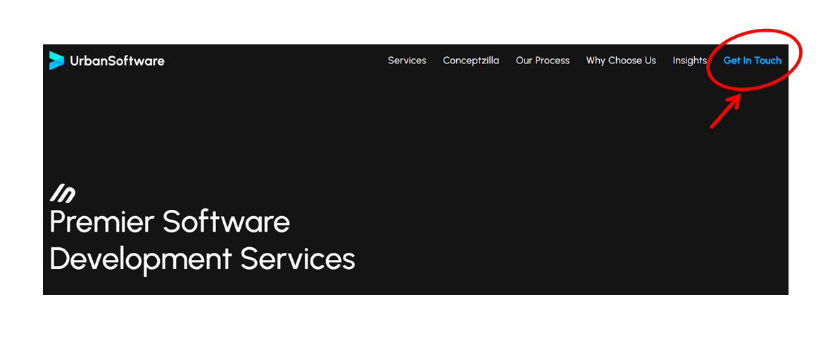
The call to action (CTA) has to be obvious but in an appealing, not in-your-face kind of design. For example:
As you can see in the image, the website has a clear CTA. Right from the homepage, the customer can spot how to get in touch for a service. Additionally, the design element of contrast makes the ‘Get in Touch’ link obvious without being forced.
You can also use other design best practices for website conversion optimization in 2024, such as clear embossed buttons and 3D design elements. Additionally, animations are perfect to make a link or a button more compelling.
b. Mobile Responsive Design
Responsive design (design that adapts to different screens such as smartphones, tablets, and laptops) is crucial to improve website usability no matter what device they are using. Since more and more online users are relying on mobile devices for everyday browsing, one of the key tips to improve mobile website conversion rate is optimization.
It comes as no surprise that over 50% of the mobile user population spends more time on websites with responsive web design. Moreover, in the absence of mobile responsive design, your website may present issues like tiny text and content that runs off-screen. As a result there is user frustration, thus lowering website traffic and website conversion rates.
Having a responsive design helps you enhance user experience and boost engagement. So, inlcude mobile optimization in your design plan to guarantee accessibility and get a high converting website!
c. Easy & Uncomplicated Navigation
Imagine working hard to get website traffic and losing it to a confusing layout. Know whether or not your website is easy to navigate by imagining if you were a customer browsing your website.
- In case you were looking to buy something, is it easy to find?
- Can you find it quickly? How many steps before you reach the desired page?
- Do you feel like this layout is meeting your website usability standards?
Make your website accessible via navigation while focusing on clarity. If you opt for links within pages, then invest in website content optimization to get to the point fast. Once the change is done, you can use a free website analytics tools for conversion tracking and see the progress!
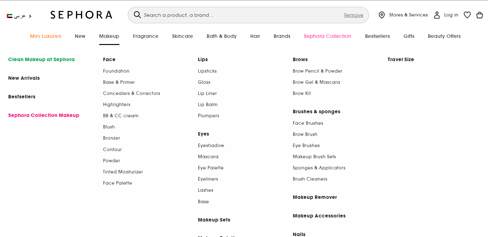
Here’s an example of a website navigation menu that improves lead generation. Right from the homepage, the customer can head straight to their desired subcategory on Sephora. The layout is also pretty concise so that the visitor is not overwhelmed despite the numerous links in one section.
3. Nail Your Content & SEO Strategy
It’s not enough to mention a keyword that is relevant to your business. Your search strategy is lacking if you don’t opt for website content optimization to adequately answer queries that originally led a visitor there.
It may sound ideal that someone searching for products in Abu Dhabi lands on your website for Dubai eCommerce sales. But, you’re looking at a search engine optimization (SEO) complication that hinders the right visitor’s journey through the conversion funnel.
Your website becomes a red flag for search engine algorithms in terms of content relevancy—which affects ranking, website traffic, lead generation, and ultimately website conversion rate.
Here are a couple of search engine optimization (SEO) best practices for a high converting website:
- Use a balanced mix of short and long keywords, preferably with accurate location-based words
- Base long-tail KWs on question-based searches for your niche for high-quality lead generation
As for how to write website content for conversions, keep things interesting. Go for website content optimization and choose headings that inspire engagement. W rite what your audience wants to read, and how they want to read it. Check the tone—casual or formal—as suitable to the product or service and its target market.
When creating landing pages to increase website conversions, take on a more persuasive, exciting tone than you would for any other content. Moreover, use landing page optimization techniques such as clear CTAs and minimal but captivating information and media elements for a high conversion rate.
Don’t forget to track your progress. Website data analysis is a great way to begin. Web analytics offers valuable insights to evaluate performance, user behavior, and optimization possibilities. Furthermore, go for a/b testing, which removes the need for guesswork in website optimization.
4. Focus On Saving Time Everywhere
If they have to wait more than 3 seconds, then half of online users will likely leave a website. Needless to say, this problem needs to be addressed if you want to push your leads down the conversion funnel.
As you can see in the image above, Google recommends your webpages take a minimum of 5 seconds (3 seconds for advanced connections) to load. For high converting website—especially high-converting home page and landing pages, speed up page loading speed.
Here’s how you can optimize your website:
- Choose minimal front and back-end structure. An experienced website design team can help.
- Use high-quality images and videos, but not weighty, especially for a high-converting landing page.
- If you’re focused on eCommerce sales, avoid complex forms and a lengthy checkout process.
- Get mobile responsive design. Optimizing web design improves speed on smaller screens.
- When you select a web hosting service, go for one that has an optimal speed guarantee.
Keep things quick and straightforward—using a/b testing tools for website optimization to check speed changes. Remember: a fast website is a high converting website.
5. Routinely Track Website Progress
How do you know if your tactics increase website conversions? Use website analytics tools to identify key metrics such as page views, duration on page, and bounce rate. Additionally, go for conversion tracking itself to see if changes in other metrics correlate with the conversion rate. You can easily find free website analytics tools for conversion tracking, as well as opt for professional website analytics services.
Moreover, consistent a/b testing progress tracking is a smart way to pinpoint issues with your website as soon as they happen. Use a/b testing tools for website optimization along with website data analysis. This will allow you to make changes for better user experience (UX) design, loading speed, content readability, and more.
Increase Website Conversions with Urban Software!
You’ve covered the basics of increasing website conversion rate. It’s a convenience and aesthetics-driven digital world, why are you holding out on getting us to design and develop a high converting website for you?
At UrbanSoftware, we provide top-notch website solutions, applying user experience (UX) design, search engine optimization SEO, and other methods to ensure you gain high traffic and conversion. Let us help you turn your brand’s digital presence around—call us today at +15595540082 / +971527174508 or email us at info@urbansoftware.tech to get started!


